


The Project
Elementokens is a 2D top-down tactics battler. In it, you play a team of wizards battling another team for control of an elemental island. Using Action Points, you move around the board to collect the titular Elementokens to collect spell cards that you can cast. Play goes back and forth between the two teams. The last team standing wins. The game was built in a custom engine over the course of eight months work.

What I Did
I served primarily as a systems and UX/UI designer, with minor additional narrative and level design responsibilities.
-
Developed physical and digital prototypes for high concept testing.
-
Designed UI elements and behavior such as unit information, spell cards, and menus.
-
Designed core gameplay loop centered around spells with elemental typing.
-
Conducted playtests at multiple stages of development.
-
Wrote narrative treatment for overall story and characters.
-
Created art assets for units, icons, and biome tiles.
-
Led discussions during development and pushed for better communication between design and programming teams.
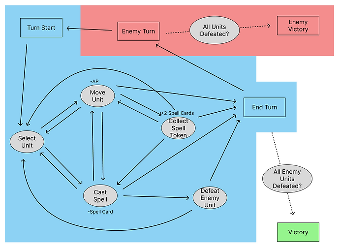
A diagram of the core gameplay loop
What I Learned
This was the first project that I worked on with programming-focused developers. We were a small team of 7 people, 3 designers, 4 programmers. It took some adjustments to get used to working across disciplines. Communication and organization was a big focus for our group. We held meetings regularly so the design team could could continuously provide updates to the programming team. That way, as we prototyped new features and cut others, the programmers could adjust the engine as needed.
Systems Design
The spell system was first conceptualized as many elements that could be combined for different effects. I pushed to scope down the number of unique elements and spells and focus on a smaller number of core elements. It went down to 8 elements, then further down to just 4. To add complexity to these core elements' spells, I designed the spells with soft themes based on the element they embodied. For example, fire spells had low range but good damage output, reflecting the destructive fire element.
Originally, when you collected an Elementoken, you had that spell equipped until you collected a different one. I pitched the design of making spells single-use, requiring players to continuously collect tokens to refresh their spells, incentivizing movement around the field.

UX/UI Design


First Spell Card Interation
-
Focused on communicating information with vibrant colors and recognizable icons.
-
Left room for descriptive and flavor text.
-
Numbers for damage, range, and accuracy are front and center.

A lot of my time went into prototyping how the UI of the game would look and behave. Action Points is a key resource, so I wanted to make sure players easily knew how much their units had. Because the amount of AP each unit has is only 5, each point could be displayed individually, fading out as they're expended in-game.
When designing the spell cards, I wanted to use icons to represent each stat rather than text for a more appealing design. The important stats were damage, range, and accuracy, which I chose to represent with a sword, arrow, and crosshair respectively. I also set a space for the spell's element. It contrasted the numbers with a simple icon rather than more words, which were reserved for the flavor text at the bottom. In the end, we went with simpler icons, and the element display was shifted up to make room for a new AoE stat.
Second Spell Card Iteration
-
Colors are more unified, card is less visually distracting.
-
Icons are simpler and easier to display in a custom engine using programmer assets.
-
Spell stats are still front and center, the numbers are large and prominent.

Additional Material
